Client
Graphic Design Club at
California State University Fullerton
Deliverables
Brand Identity
Event Branding
Design System
Print & Digital
Deliverables
Creative Team
Art Direction/Illustration/Graphic Design:
Danielle Gee
Design Professor: Chen Wang
Neon Artist: David Otis Johnson
Graphic Design Club at
California State University Fullerton
Deliverables
Brand Identity
Event Branding
Design System
Print & Digital
Deliverables
Creative Team
Art Direction/Illustration/Graphic Design:
Danielle Gee
Design Professor: Chen Wang
Neon Artist: David Otis Johnson
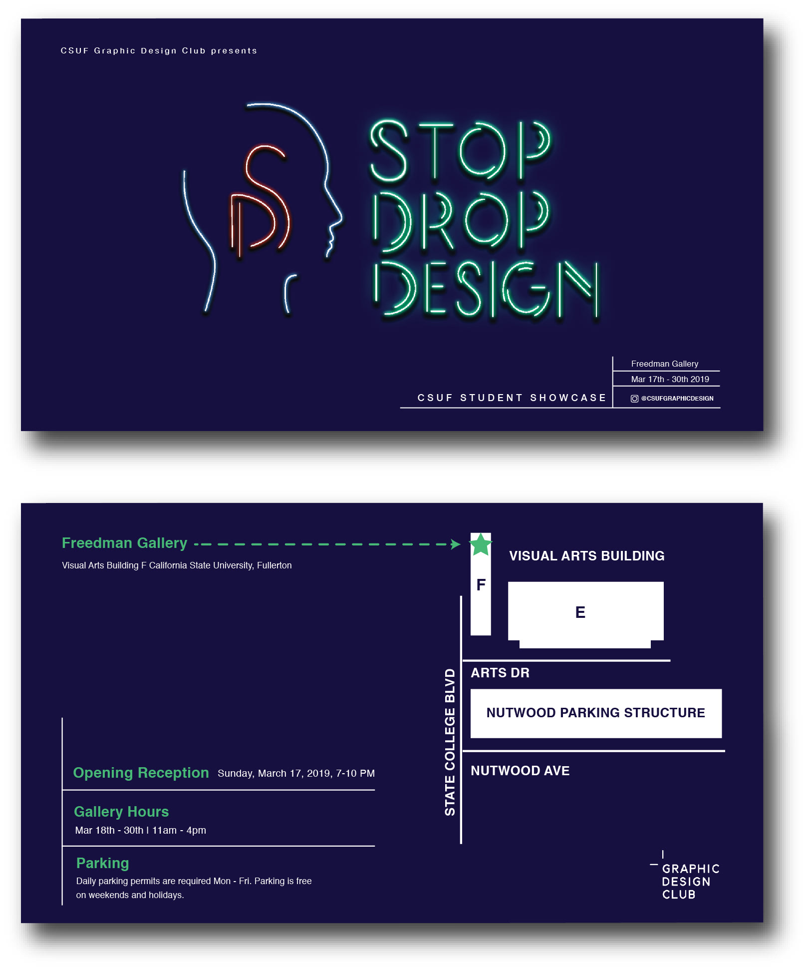
The Graphic Design Club at CSUF held a competition to design the branding for their 'STOP DROP DESIGN' exhibition, and my branding was selected from among hundreds of students. The exhibition showcased creative work from students across various disciplines, with the goal of creating a visual identity that welcomed both students and the local community.
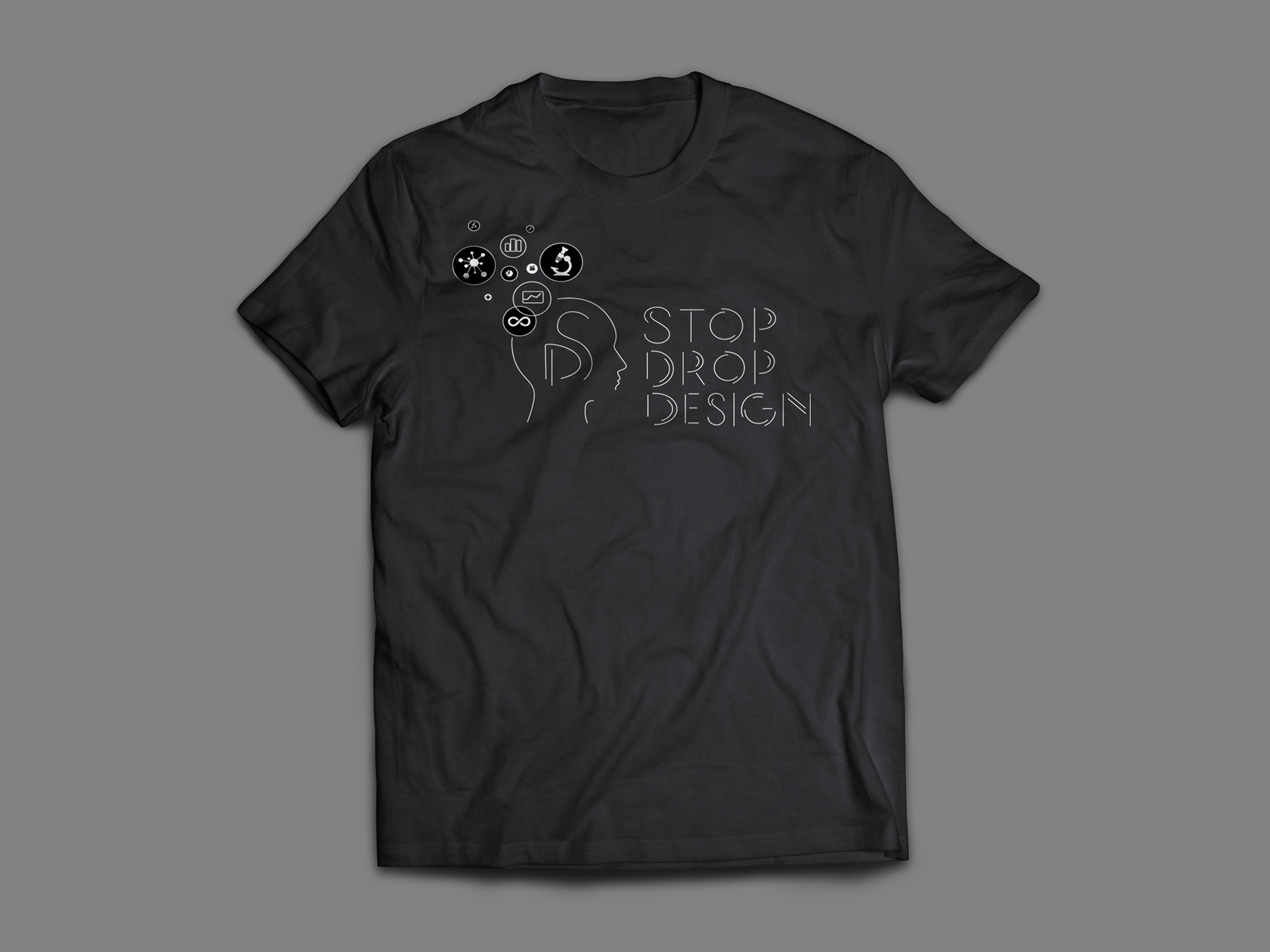
My branding created an inclusive space for collaboration and artistic inspiration, transforming the event into a vibrant hub for cross-disciplinary engagement. Held both on campus and at local venues, the exhibition invited everyone to connect through design. I took a minimalist approach, using clean lines and a monogram to symbolize the birth of ideas and the early stages of the creative process. The design was warm, universally legible, and welcoming. I executed and art directed the entire branding campaign from concept to final delivery.
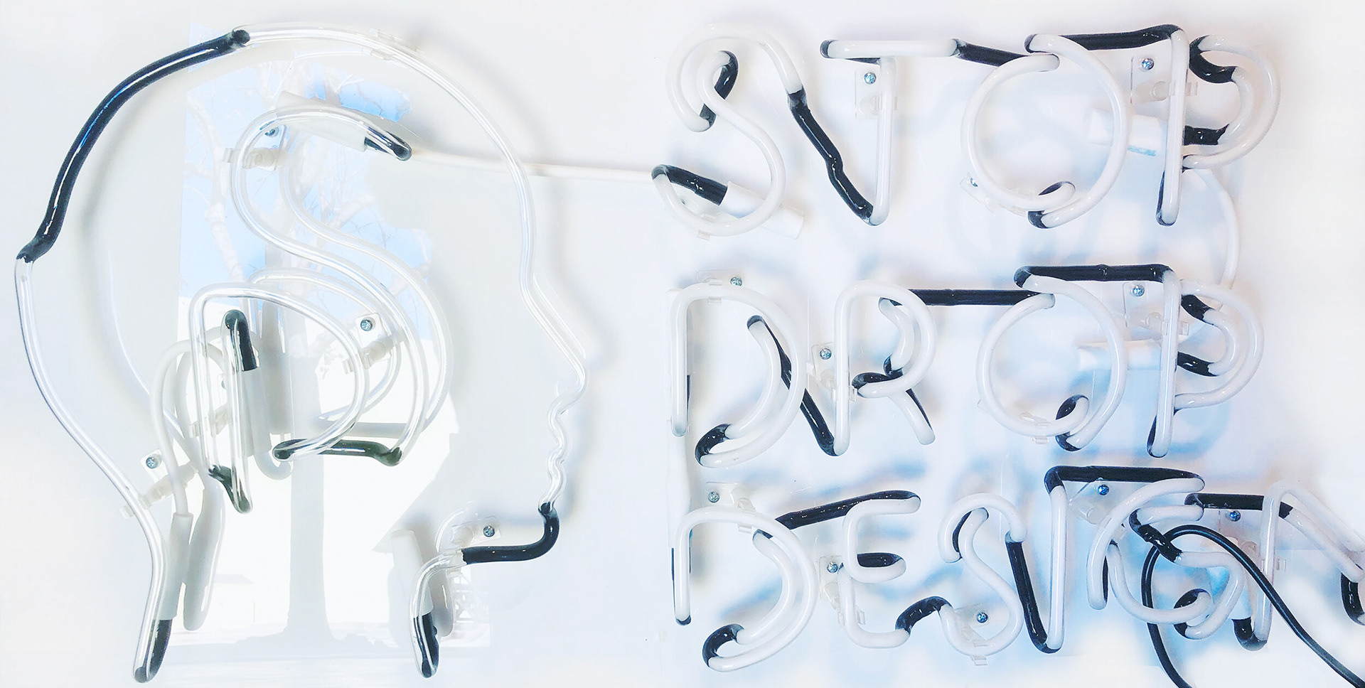
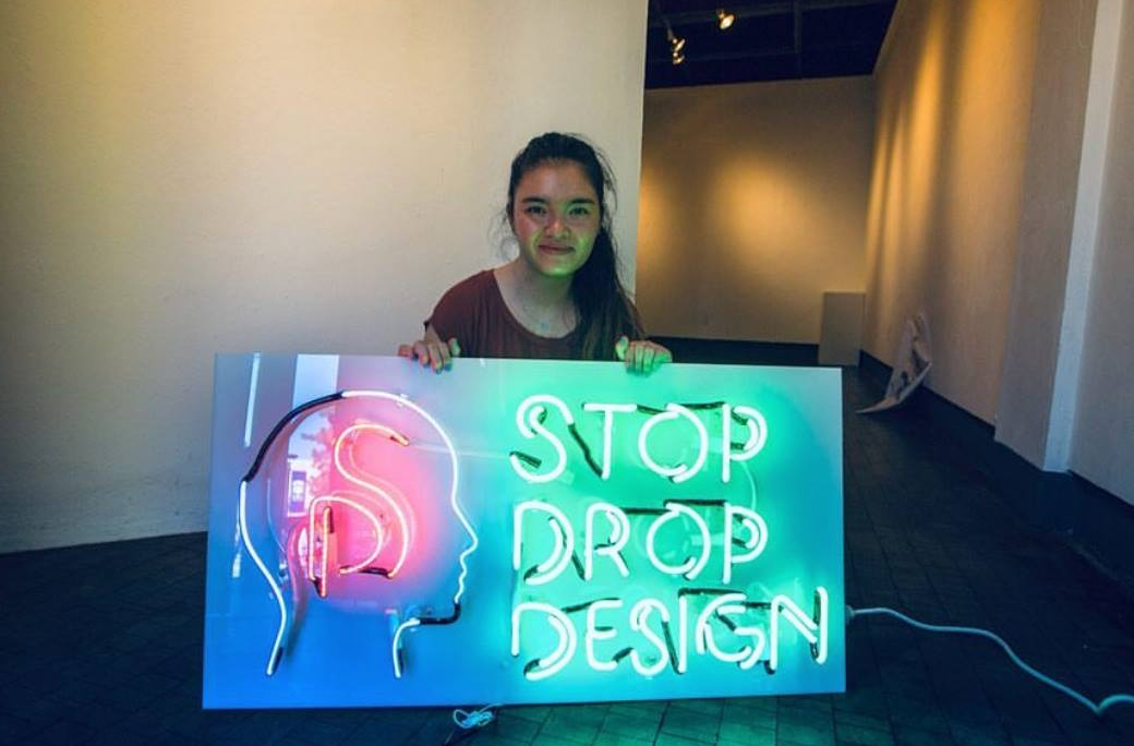
The concept for the branding as a neon sign came to me while brainstorming ways to create a bold and memorable centerpiece for the exhibition. On a whim, I reached out to neon artist David Johnson from the Museum of Neon Art in Los Angeles, asking if he could help bring my design to life. He enthusiastically collaborated with me to create the striking neon sign, which became the visual centerpiece of the exhibition and greatly amplified its artistic impact.
Simple Lines and Ideas
Keeping it simple, line work symbolizes the creative process, representing the initial stages of thought where ideas begin as simple lines or sketches. The monogram within the head illustrates how these concepts evolve into reality. This concept inspired the design of the 'STOP DROP DESIGN' logo, showcasing the journey from inspiration to fully realized creativity.
Back to the Basics
The color palette of red, blue, and green was intentionally chosen to evoke a sense of clarity and simplicity.
These fundamental colors serve as a reminder of the origins of design and creativity, grounding the project in a timeless aesthetic. By using these primary hues, the design emphasizes the importance of foundational elements, allowing the
ideas to shine through without distraction.
These fundamental colors serve as a reminder of the origins of design and creativity, grounding the project in a timeless aesthetic. By using these primary hues, the design emphasizes the importance of foundational elements, allowing the
ideas to shine through without distraction.
