ILIA Beauty - Packaging Rebrand
& Email Design
& Email Design
Client
ILIA Beauty
Deliverables
Package Design & Production
Print-ready files
Email Design
Marketing Materials
Creative Team
Art Direction: Danielle Gee, Angie Baney
Graphic Design/Photography: Danielle Gee
Creative Director: Angie Baney
ILIA Beauty
Deliverables
Package Design & Production
Print-ready files
Email Design
Marketing Materials
Creative Team
Art Direction: Danielle Gee, Angie Baney
Graphic Design/Photography: Danielle Gee
Creative Director: Angie Baney
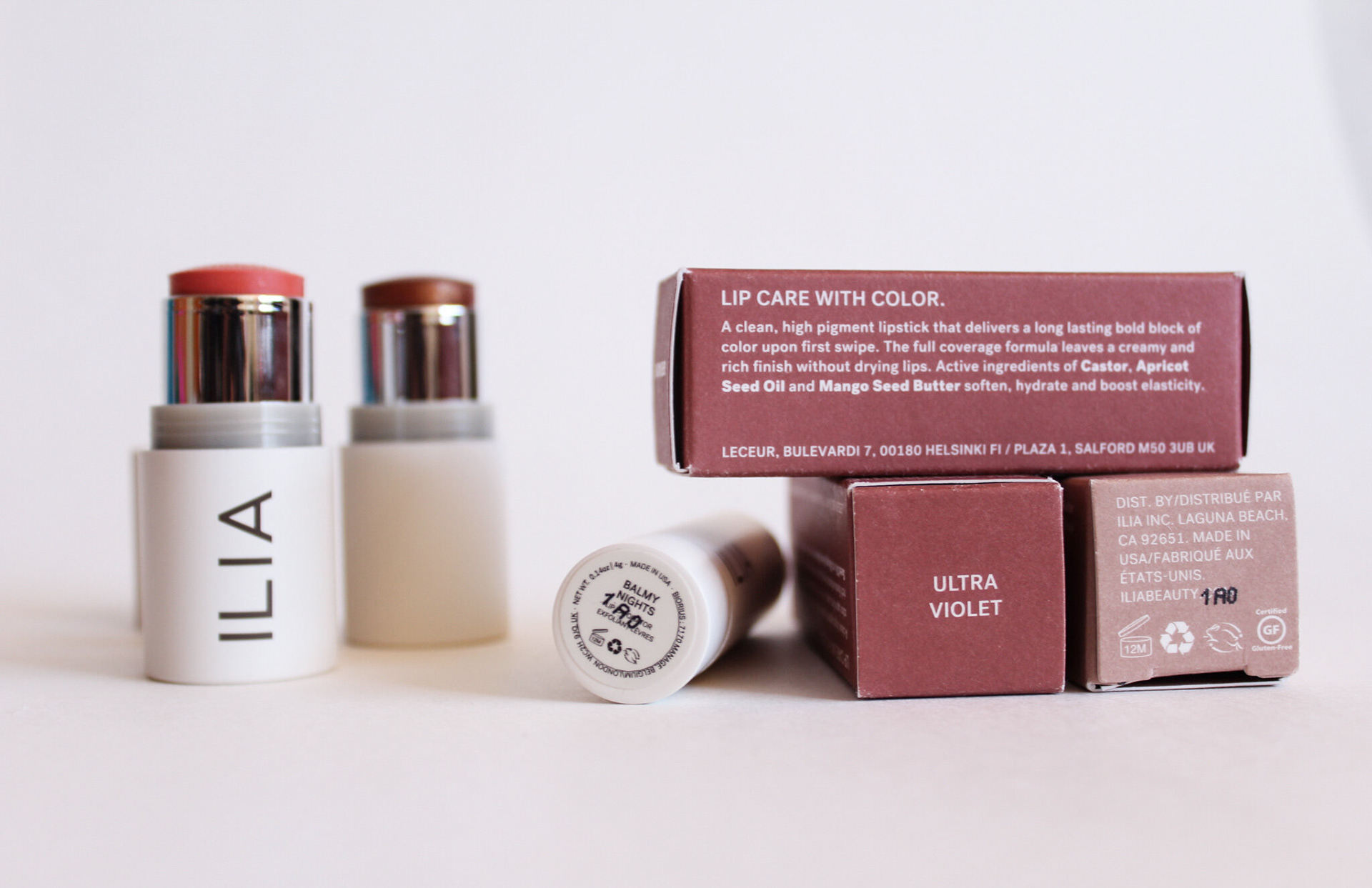
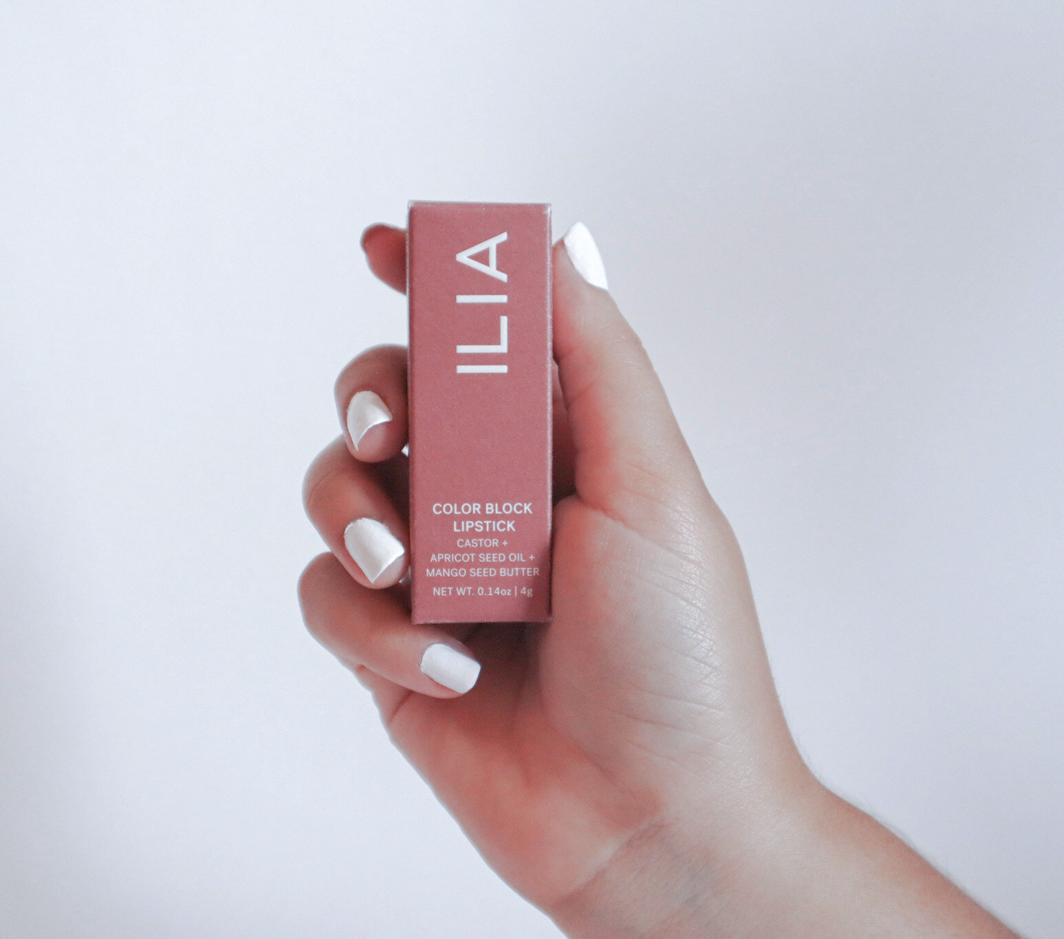
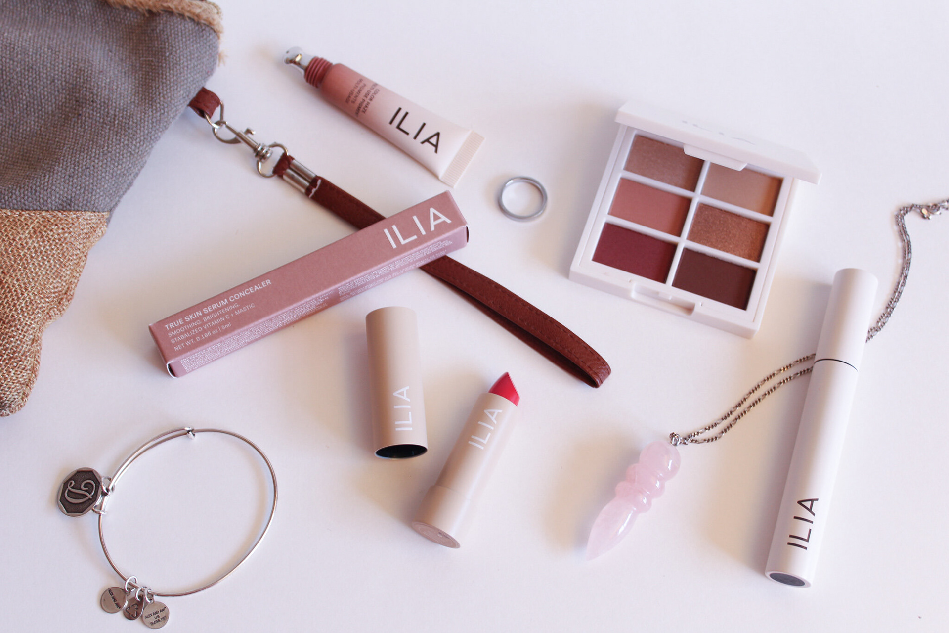
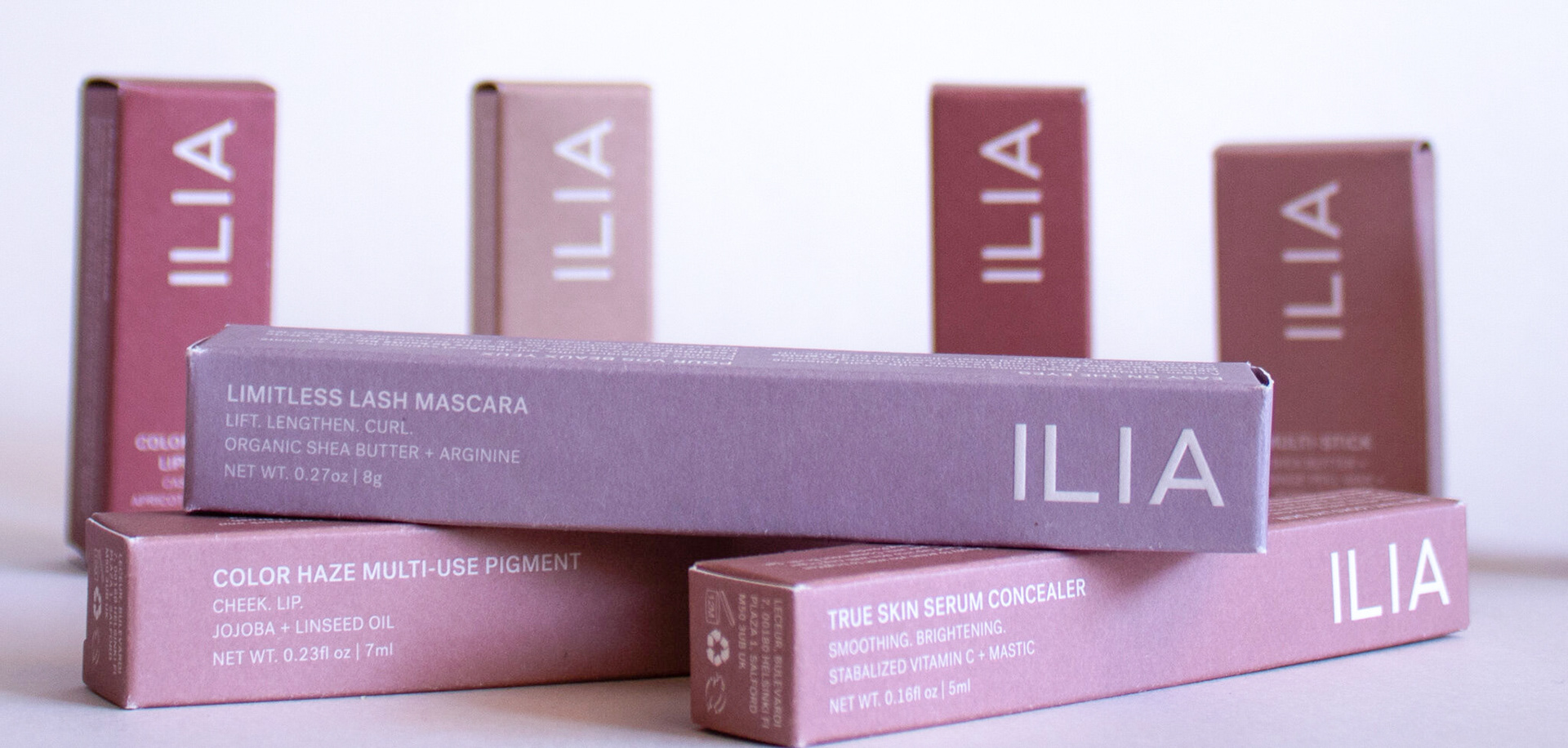
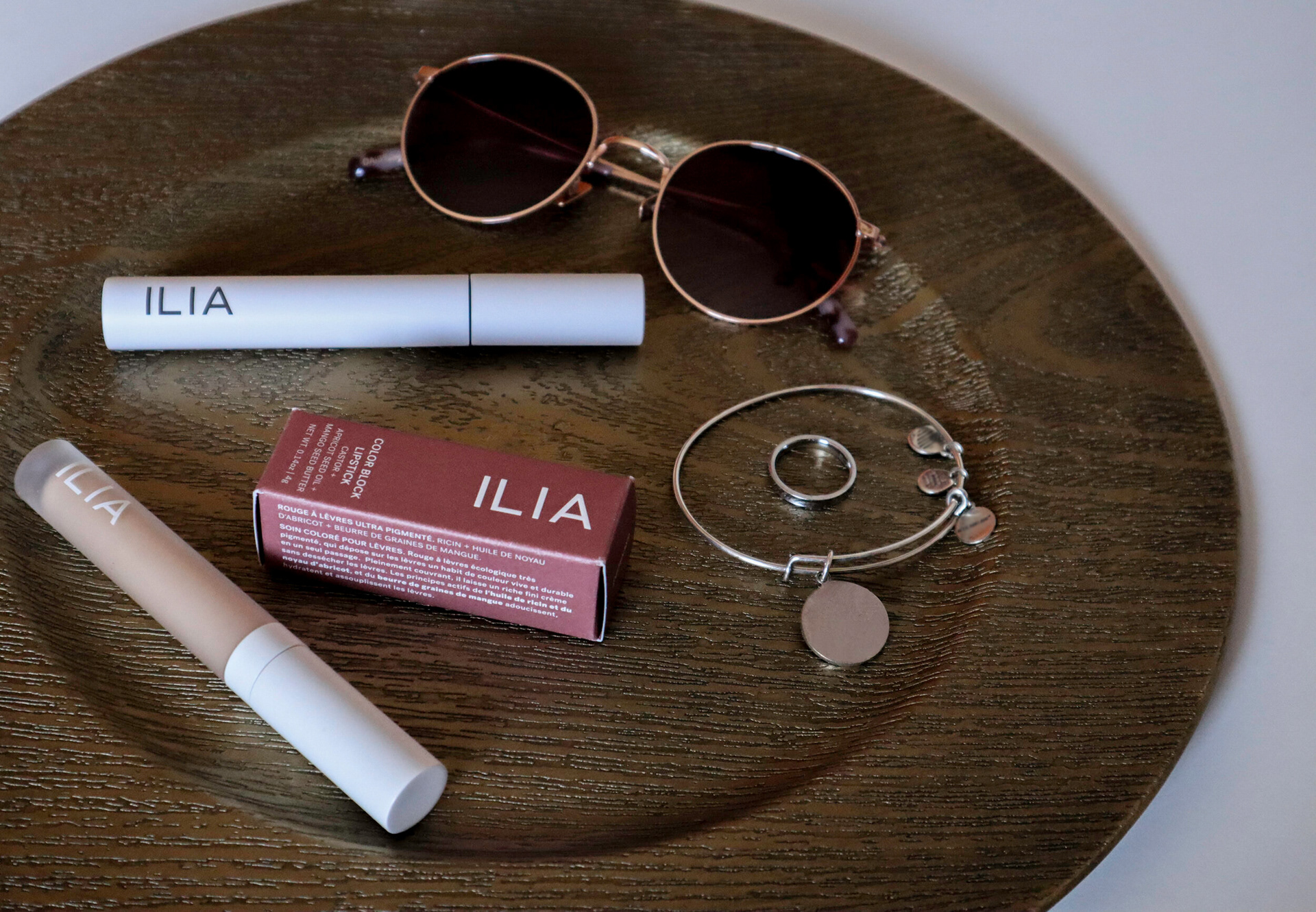
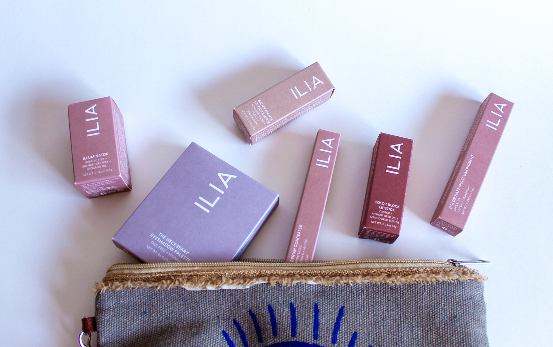
ILIA Beauty sought to elevate their brand through a comprehensive rebranding of their packaging, covering over 200 cosmetic products. Their goal was to create packaging that aligned with their clean beauty philosophy while emphasizing sustainability and innovation. To achieve this, they needed marketing materials that showcased the new packaging in a way that would resonate with their audience and strengthen their
market presence.
market presence.
At ILIA Beauty, I worked closely with the art director, product developer, and founder to support the rebranding of their cosmetic line. My role focused heavily on production, ensuring that over 200 product packages were accurately laid out and ready for print. I managed file preparation, coordinated with printing vendors, and resolved technical issues to ensure flawless execution. Additionally, I created marketing materials for various campaigns, ensuring consistency in presentation while supporting the broader goals of the brand.
Email Campaign
Design Strategy Breakdown
Designing for Clarity and Impact
The bold headline ensured the promotion is the star of the campaign.
Using clear, modern typography emphasizes urgency, while the subtle background textures echo the tactile nature of the makeup application,
tying directly to ILIA's product experience.
Color & Texture Inspired by the Brand
Each email features textures and tones derived from ILIA's product line
–red for lips, nude for face, and mauve for eyes. These choices reinforce brand identity while creating a cohesive story across product categories.
Streamlined Navigation for a Seamless Experience
Products are grouped into intuitive categories (lip, face, and eye) to make browsing effortless. Call-to-action buttons like "Shop All Lip Products"
guide users with clarity, ensuring a frictionless shopping journey.
Clean Beauty, Clean Design
The minimalist layout reflects ILIA’s commitment to transparency and simplicity. Concise product descriptions and clean design elements highlight the brand’s values, emphasizing non-toxic, high-performance skincare and cosmetics.
User-Centric Calls-to-Action
Contrasting buttons encourage engagement, while the easy-to-spot promo code "GOCLEAN" reinforces ILIA’s clean beauty philosophy. This thoughtful placement drives conversions while staying on-brand.
Cohesion Across Channels
The typography, color palette, and product presentation align seamlessly with ILIA’s visual identity, creating a polished campaign that feels natural across both email and website experiences.
